Global Intranet Redesign
Helping 165 regional teams find what they need
- Client work
- Research-led
At a glance
- Client
- Global financial institution (under NDA)
- Role
- Led the redesign: UX research, content strategy, IA, visual design
- Team
- Me + Communications partners across regions
- Timeline
- 5 weeks, May 2024
- Tools
- PowerPoint (no Figma access), focus groups
- Project type
- Client work
- 20%
- Improvement in content findability (YoY)
- 20%
- Increase in event participation across 12 activations, supported by the redesign
- ~12K
- Page views on a supported series over 9 months
- 165
- Locations adopted the template system
TL;DR
A Communications partner in Singapore couldn't find the resources her regional team needed. I led the redesign of two intranet pages used across 165 global locations, advocating for research instead of adding more content. The redesign improved content findability by 20%, supported a 20% increase in event participation across 12 activations, and established a scalable template system.
Problem
As a junior communicator taking on design work, I heard from a peer in Singapore that regional teams were struggling with an outdated intranet. Employees couldn't find clear, timely information about cultural moments and global observances.
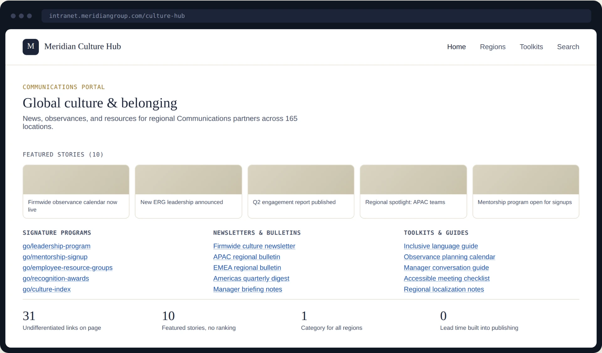
Two pages had grown into long, undifferentiated hyperlink lists, with 10 featured stories competing for attention. Senior leaders wanted a quick redesign and more content. I advocated for a different first step: talk to users before changing anything.
Research
I ran focus groups with 15 Communications partners and employees across Chicago, Bengaluru, and Singapore. Employees preferred hearing from leaders close to their daily work, and important content wasn't appearing on the team homepages where they actually looked.
Regional partners needed 1–2 weeks of advance notice to localize messaging. Cultural context also varied: what resonated in New York didn't necessarily translate to Hong Kong.
A content audit and engagement metrics showed that we already had useful resources. The structure served the people creating content, rather than the people trying to find it.
Process
With no Figma access, I designed in PowerPoint. The redesign went through three iterations: one informed by stakeholder edits and two by user testing.
Each round tightened the hierarchy, refined category labels, and made the structure easier to scan.
Solution
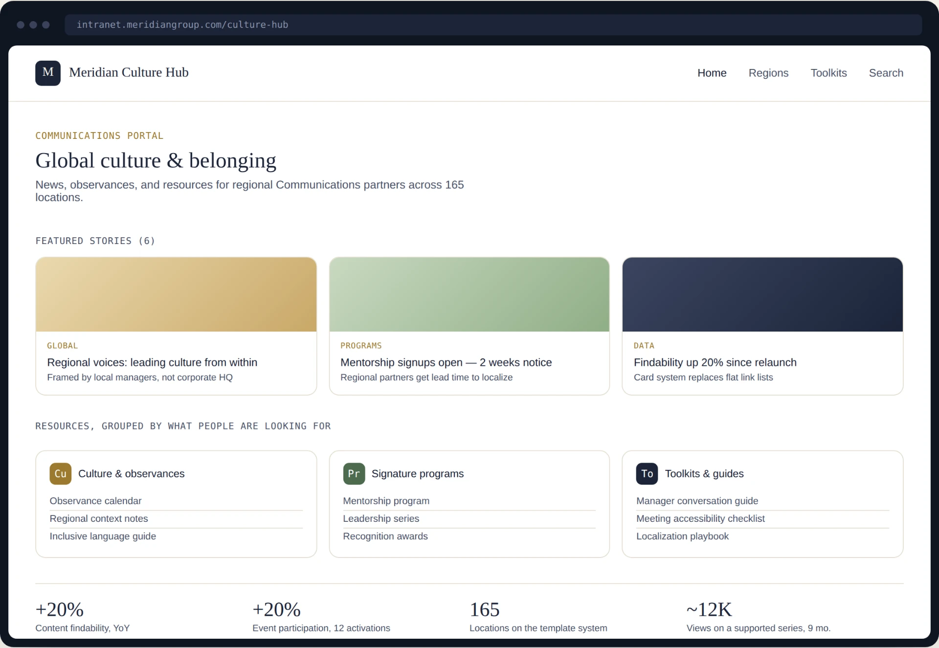
Featured stories went from 10 to 6, reducing competing priorities. Long hyperlink lists became clearly labeled card groups, with a visual hierarchy that made resources easier to scan.
Categories were restructured for global audiences, not only US-based employees. After launch, user requests led to an archive page that preserved access to older content while keeping the homepage focused.
Outcomes
Content findability improved by 20% year over year. The new template system supported a 20% increase in event participation across 12 activations.
A supported content series received approximately 12,000 page views over nine months. The scalable template system is now used across 165 global locations.
20%
Improvement in content findability (YoY)
20%
Increase in event participation across 12 activations, supported by the redesign
~12K
Page views on a supported series over 9 months
165
Locations adopted the template system
Reflection
Users don't always need a new product. Sometimes they need a better version of what already exists. The most impactful improvements came from organizing existing content and giving people clear signposts, not adding more.
Advocating for users also meant pushing back on leadership. When senior leaders asked for more content, I brought data showing that reorganization was the answer. That conversation was part of the design work.