What Is Your Limit?
Improving peer-to-peer payment platforms
- Concept
- Financial services
- UX Writing
At a glance
- Client
- Personal project
- Role
- Visual design, UX writing
- Team
- Independent project
- Timeline
- May 2025
- Tools
- Figma, user survey, competitive analysis
- Project type
- Concept
- 132
- Users surveyed
- 77%
- Didn't know their daily sending limits
- 31%
- Of those who checked, struggled to find limits
TL;DR
A Zelle transfer error in the Chevron Federal Credit Union app left me guessing my daily limit. A survey of 132 users and competitive analysis revealed a wider transparency problem. I redesigned the error experience to explain the limit, its timeframe, and what to do next. Validation is the next step.
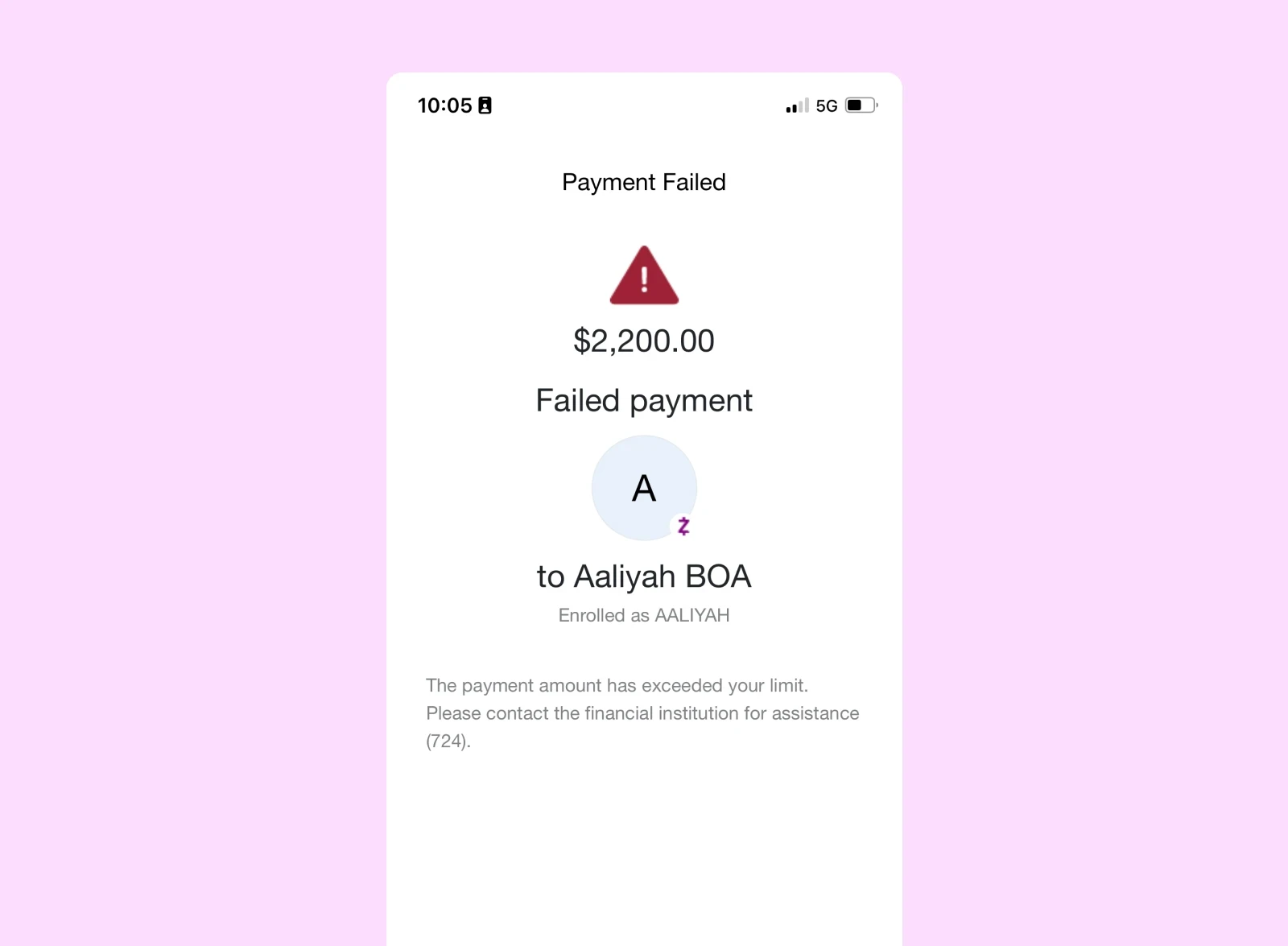
A transfer error with no explanation
I hit a Zelle transfer error in the Chevron Federal Credit Union app without knowing my daily sending limit. The message said the payment exceeded my limit and directed me to contact the financial institution, without showing the limit itself.
The experience raised a question: why should users have to fail before understanding what they can send?
Not an edge case
I surveyed 132 users. 77% didn't know their daily sending limits. Among those who checked, 31% struggled to find the information.
Competitive analysis showed most banks relied on reactive, error-first patterns rather than proactively guiding users.
Balancing transparency with simplicity
I focused the redesign on CFCU's Zelle error experience, using visual design and UX writing to turn a dead end into an educational moment.
The design had to surface useful information without adding interface clutter: the daily timeframe, the actual sending limit, and actionable next steps.
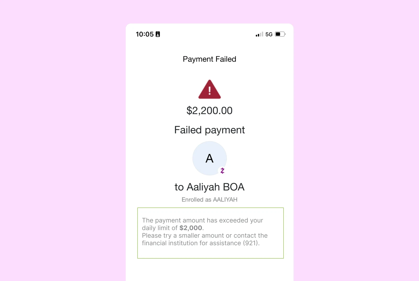
An error that helps you move forward
The updated microcopy explicitly states that the limit applies to the day, displays the actual limit, and offers next steps. Instead of making users search elsewhere, the message gives them the context they need at the point of failure.
Research findings, not impact claims
The survey established a clear need for better limit visibility. The redesigned experience is a concept; improvements in confidence and clarity haven't been measured yet.
Next, I'll validate the design with the original participants to measure those gains.
132
Users surveyed
77%
Didn't know their daily sending limits
31%
Of those who checked, struggled to find limits
From failure to clarity
Thoughtful microcopy can transform moments of failure into moments of clarity — building user confidence without adding interface clutter.